html-css-challenges
Responsive Layout
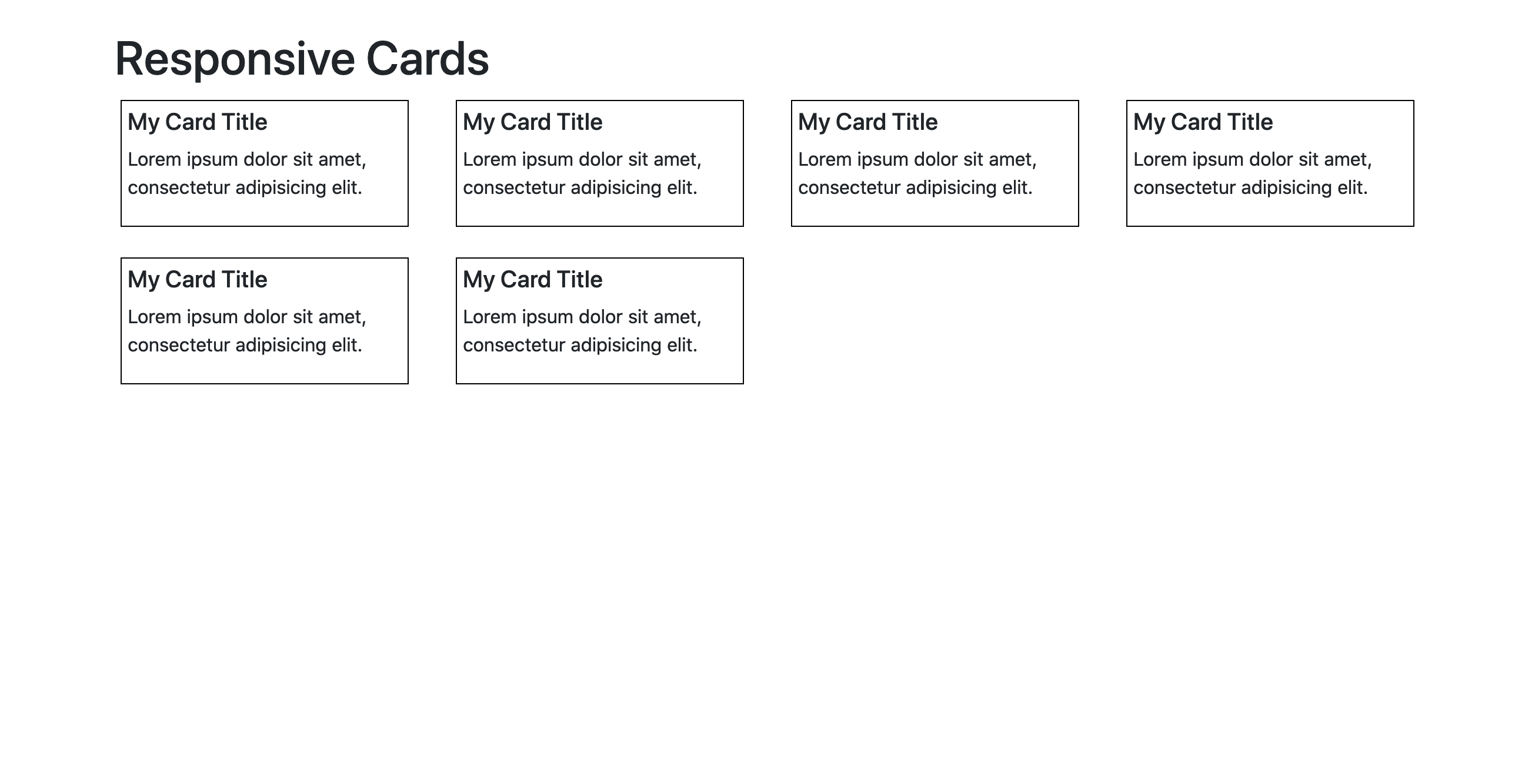
Background & Objectives
The aim of this simple challenge is to create a responsive layout for cards.
Specs
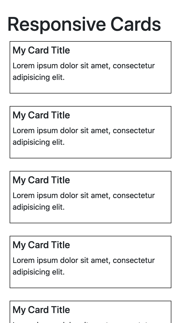
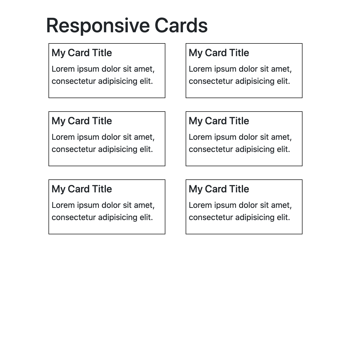
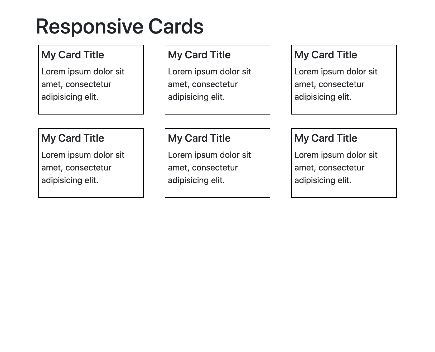
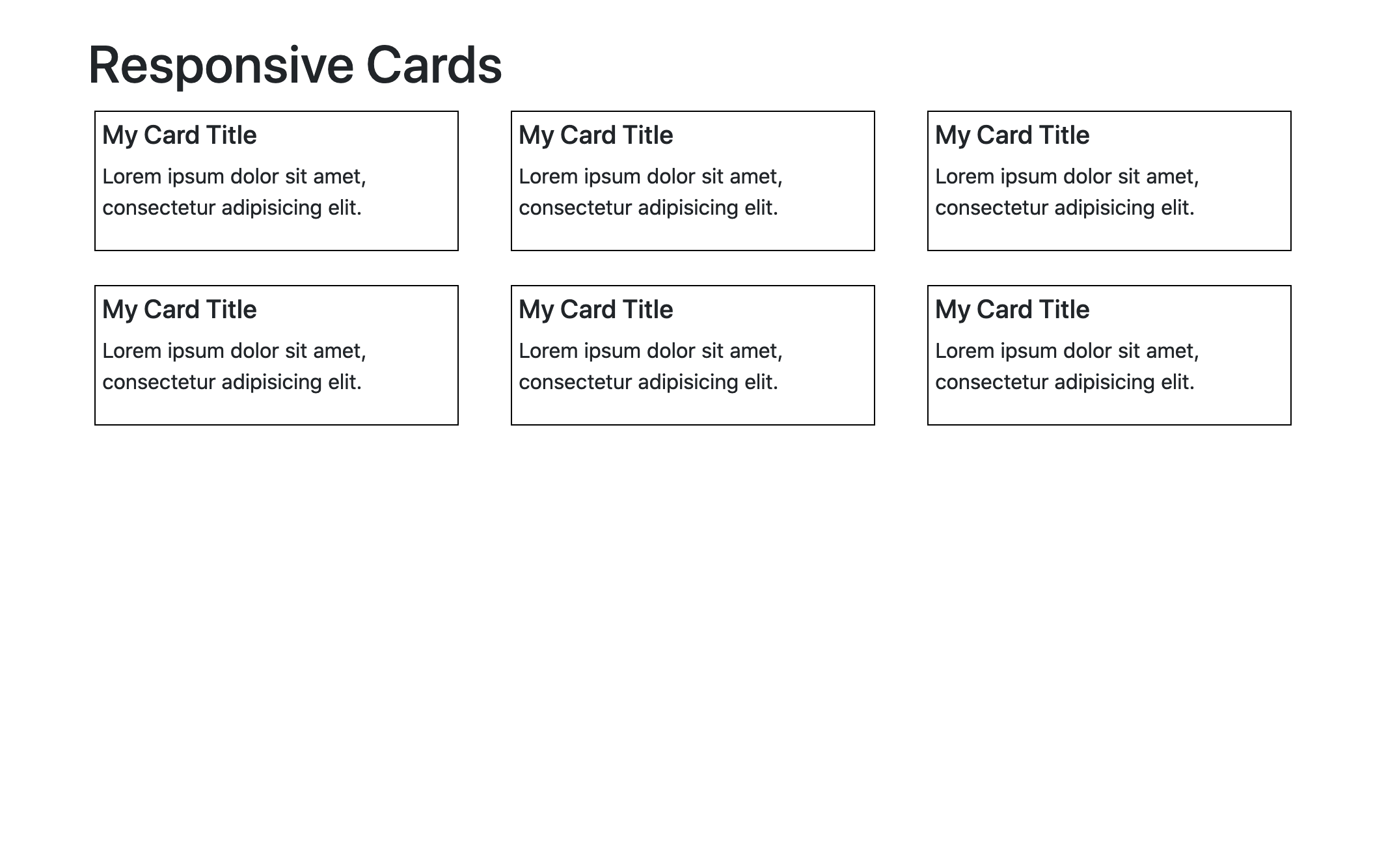
We want our cards to display as 1 single card per row on super small devices. We want to have 2 cards next to each other on small devices. We want to have 3 cards per row on tablet, and 4 cards per row on extra large desktops.
Basically depending on the width of the device, the result should match the following screenshots:
| xs device | sm device | md device | lg device | xl device |
|---|---|---|---|---|
 |
 |
 |
 |
 |
| 1 card per row | 2 cards per row | 3 cards per row | 3 cards per row | 4 cards per row |
You can also see the end result here.
Tips & Resources
- You can use Bootstrap Grid to build the layout for the different sizes.
- Hint: To include the library in the page, look for
Bootstrap CDNon Google and copy the css file’s url to your<link rel="stylesheet" href="...tag.
- Hint: To include the library in the page, look for